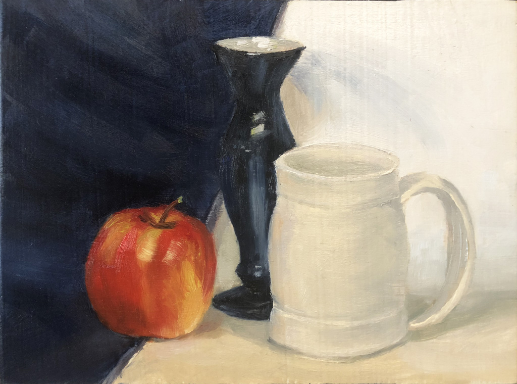
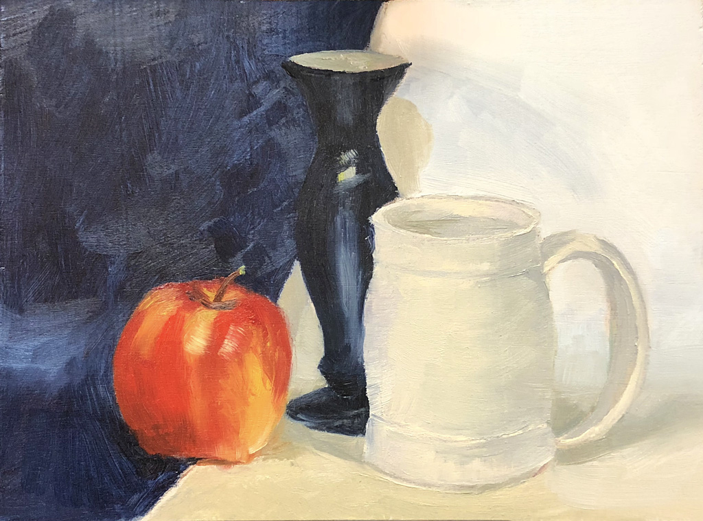
As promised, I’m posting Red, White, and Blue after working on it some more in Ken’s workshop.
I have both shown below for comparison. You’ll see that I modeled the apple quite a bit more, adding shadows and deeper reds. I worked on the bottom curve of the mug and modeled the shadows more including adding a redder tone to the left side of the mug (Thank you, Ken).
Ken shared with me his technique for blending values. Take a look at the upper left corner of the painting and how the strokes are much less distracting to the overall painting. (Thank you, Ken…again!)
The tall black vase has additional reflections to give it more volume. I also softened the shadows behind it on the right.
There are a couple areas that I should have refined more but that’s the way of creating art. Is it really ever finished??!!

