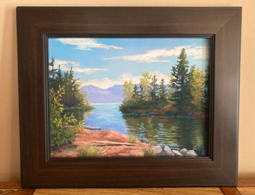
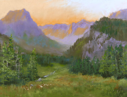
This past year, I’ve been taking an intensive workshop from Ian Roberts, an artist based in Santa Monica, California.The man has been teaching for something like 30 years and has really honed his teaching skills and his presentation of fundamental painting concepts.
Ian’s ‘Mastering Composition’ course consisted of three 6-week long, deep dive studies into drawing and composition, value and color temperature, and color intensity. Each of the three courses was followed up with a 30-day challenge to draw/paint every day to reinforce the concepts we had just learned.
The first of the series of courses was Drawing. The idea was to improve our drawing techniques so that when we explored a painting idea, we would have the skills to accurately represent our idea and to work out a strong composition before committing paint to canvas—so to speak. In my case that would be ‘pastel to paper.’
With each lesson on drawing, Ian also taught us compositional principles. The drawings were reinforcing the lessons on composition.
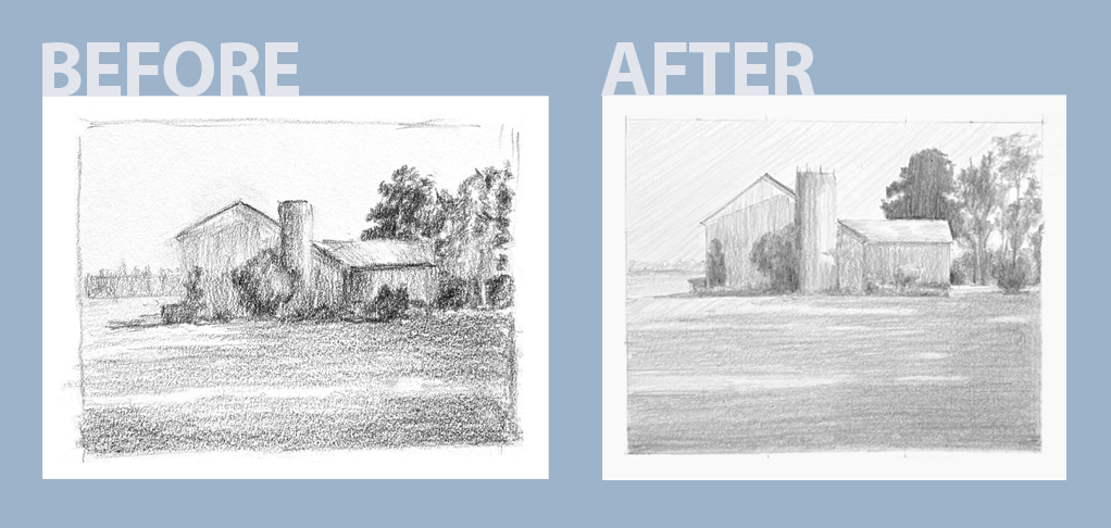
Ian had us draw one of his images before we started the class and then again at the completion of the class. As you can see in the Before and After images, my drawing skills improved greatly.
©Francesca Droll
©Francesca Droll
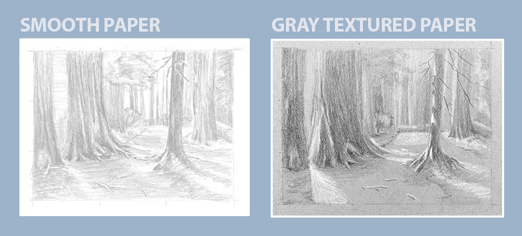
Above: We also experimented with supplies. The smooth white paper helped give smoother tones. The gray paper was so textured that it was hard to get a dense, dark tone. The fun part was using a white pencil to add the highlights on the gray paper.
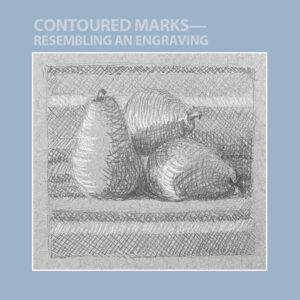
Right: We also tried different shading techniques. The contour lines on the drawing at right, represents the look of an engraver. The hatch marks making the different tones needed. The use of the white pen again added the highlights.
©Francesca Droll
In the second course, we delved deeper into value and we explored color temperature. Value is the measure of how light or dark a color is. For black, that translates to shades of gray. There is a saying among artists, “Value does all the work and Color gets all the glory.” Correct values are the foundation of the good painting while color is the window dressing.
Color temperature is how warm or cool a color is. Generally, purple would be a cool color and yellow a warm color. There are both warm and cool purples which seems to be a contradiction but add a little red to the purple and it moves toward a maroon which is warmer than a true purple. Adding blue to purple shifts it in the opposite direction to a cooler, bluer purple. The same is true for yellow. There are warmer yellows shifting toward orange and cooler yellows shifting toward green.
The image on the top shows the range of values in the black and white image. Next to it is the same image done again but this time keeping the black in the shadowed areas and putting yellow ochre in the the sunlit areas. With attention and practice, one begins to see the concept of color temperature easily in the landscape. I’m still striving to get there.
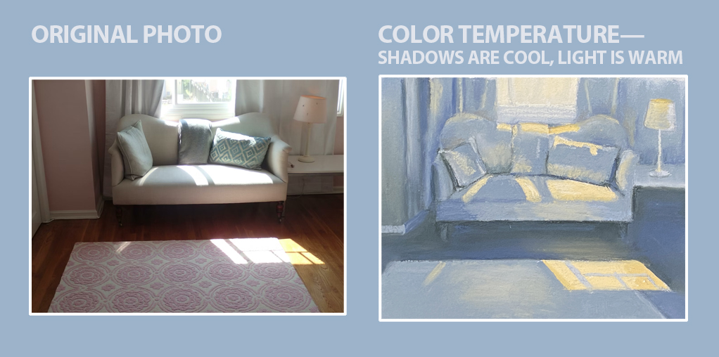
The image on the bottom was another exercise we completed. The color photo is what we worked from. We had to translate the color photo into a color temperature painting. It can be confusing sometimes when the color in the photo is a warm color, such as the pink in the rug. One would think to paint that with warm tones however that wouldn’t work in the shadow areas. The pillows are a cool color in the photo but where the sun is hitting them, one has to paint it a warm tone even if it is a cool blue pillow. We were told to simplify the photo and so we didn’t paint the detail on the rug. The shadow areas we depicted in cool blue and we used yellow ochre for all the sunlit areas. The resulting image really gives a sense of light and shadow.
In the last course of the series, we finally got to work with color. As an artist, I consider myself a colorist in the sense that I love to use color. The more the better in my book. This course taught me to be a little more thoughtful in my use of color. By reserving the brightest colors for the focal area, one can make a more impactful painting. By using darks and lights next to each other in the focal area, one can also create a more impactful painting.
Using these concepts will lead the viewer’s eye into and through the painting to the focal area. Mastering these techniques and making the concepts second nature to me while painting is my ultimate goal.
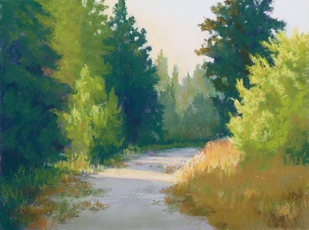
The image above is one that followed us through the courses and culminated in this color painting. Cool greens in the shadows and warm greens in the sunlit areas give a wonderful sense of light streaming through. You’ll notice there are some warm tones in the shadowed areas. The purpose is to add variety to the greens so they are not so intensely green. Adding a dull orange to the greens in the shadowed areas helps to neutralize the green and is not warm or intense enough to affect the coolness of the shadow.
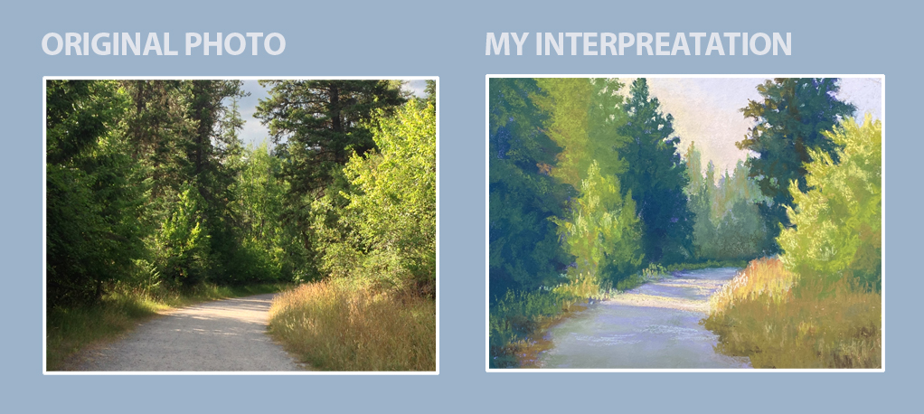
The bottom image was painted from my own photo. You can see how interpreted the photo so that it has been simplified in the painting. The intensity of the background trees is much less than in the photo. This creates a strong sense of depth in the painting and draws the eye into the scene.
As I mentioned before, the immersion into these artistic concepts over the past year was such a valuable experience. Included in the courses is another full year of access. I will be repeating each course next year to reinforce what I’ve learned and continue practicing. To make it even more challenging and interesting, I’ll be doing all the lessons in oils. I’ve decided it’s time to branch out and play with other mediums.
